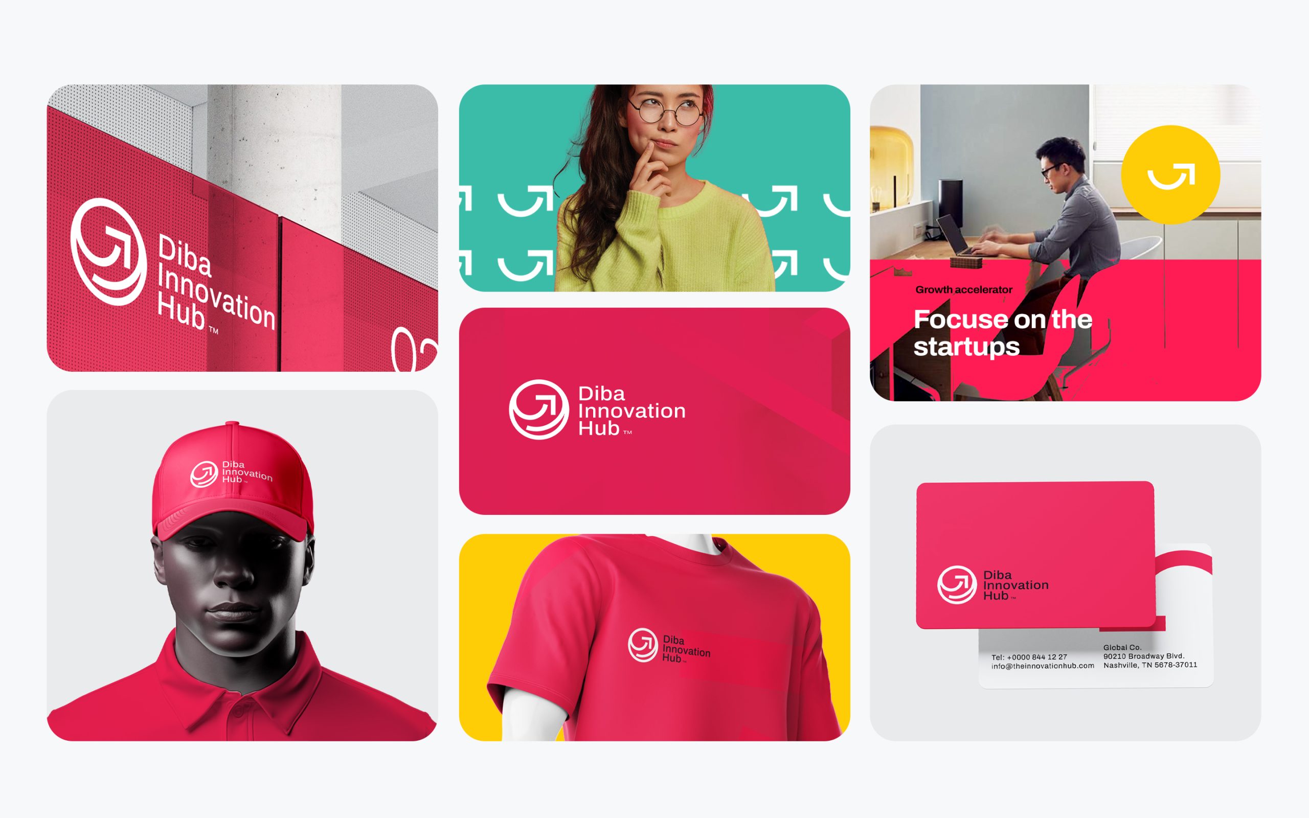
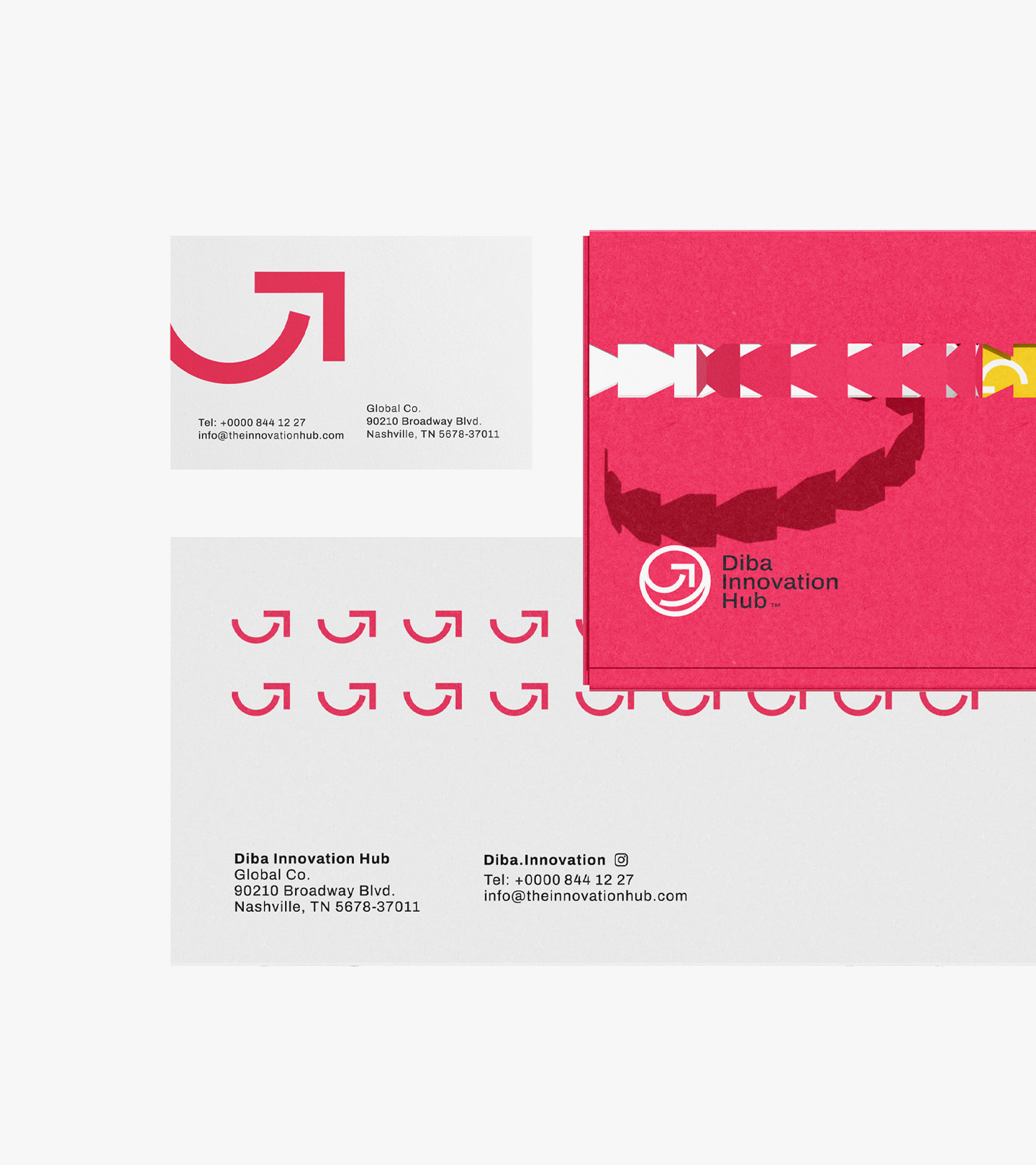
At Proment Agency, we believe that every brand tells a story .one that must resonate with its audience while reflecting its core values.
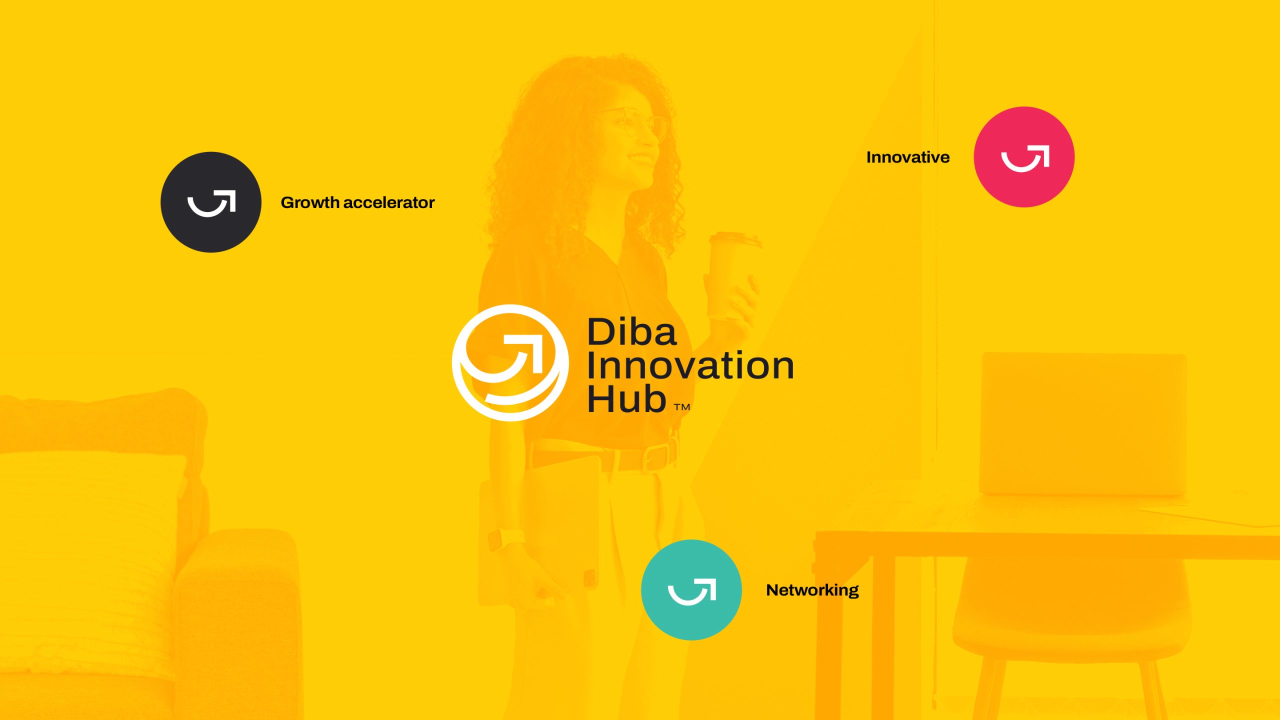
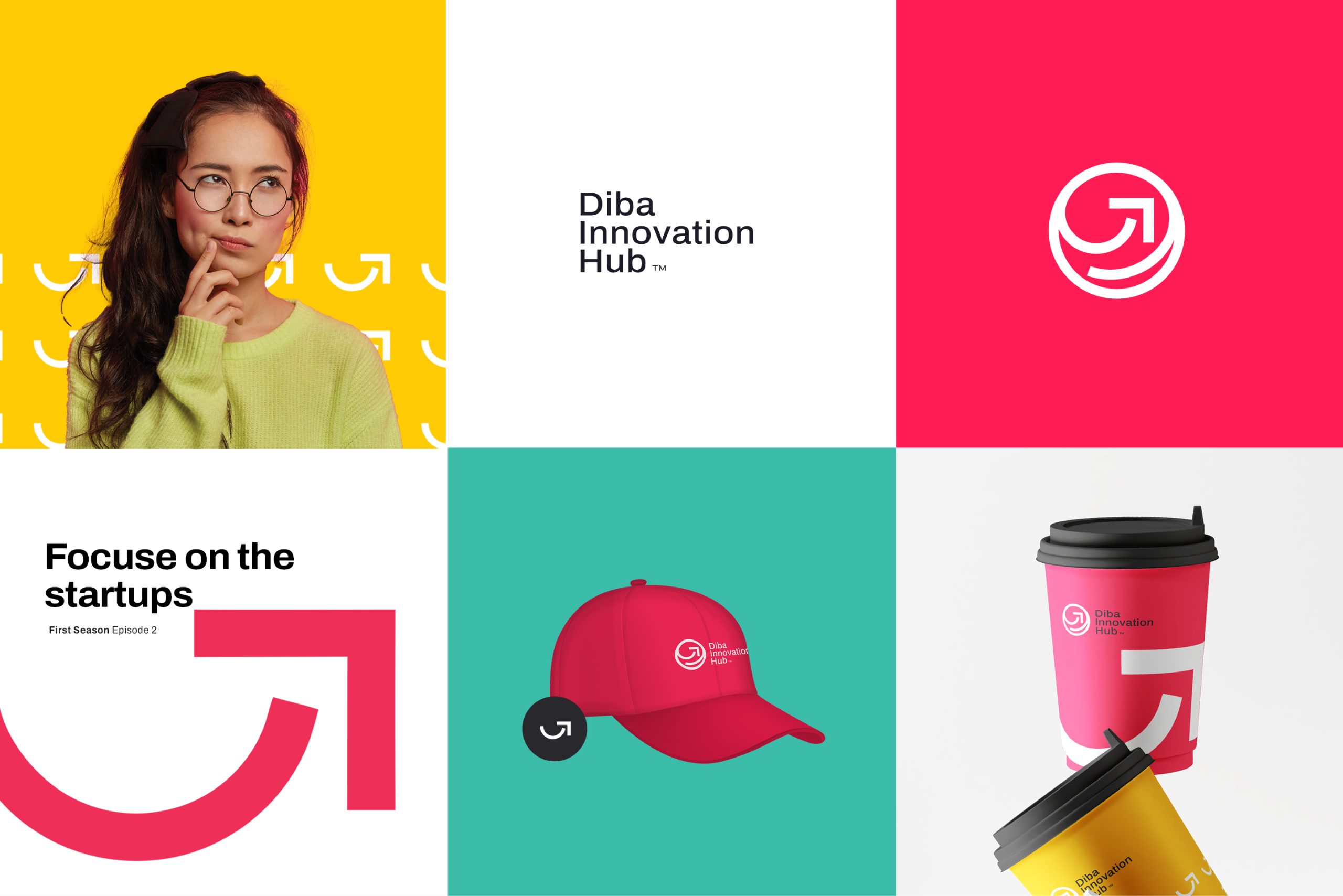
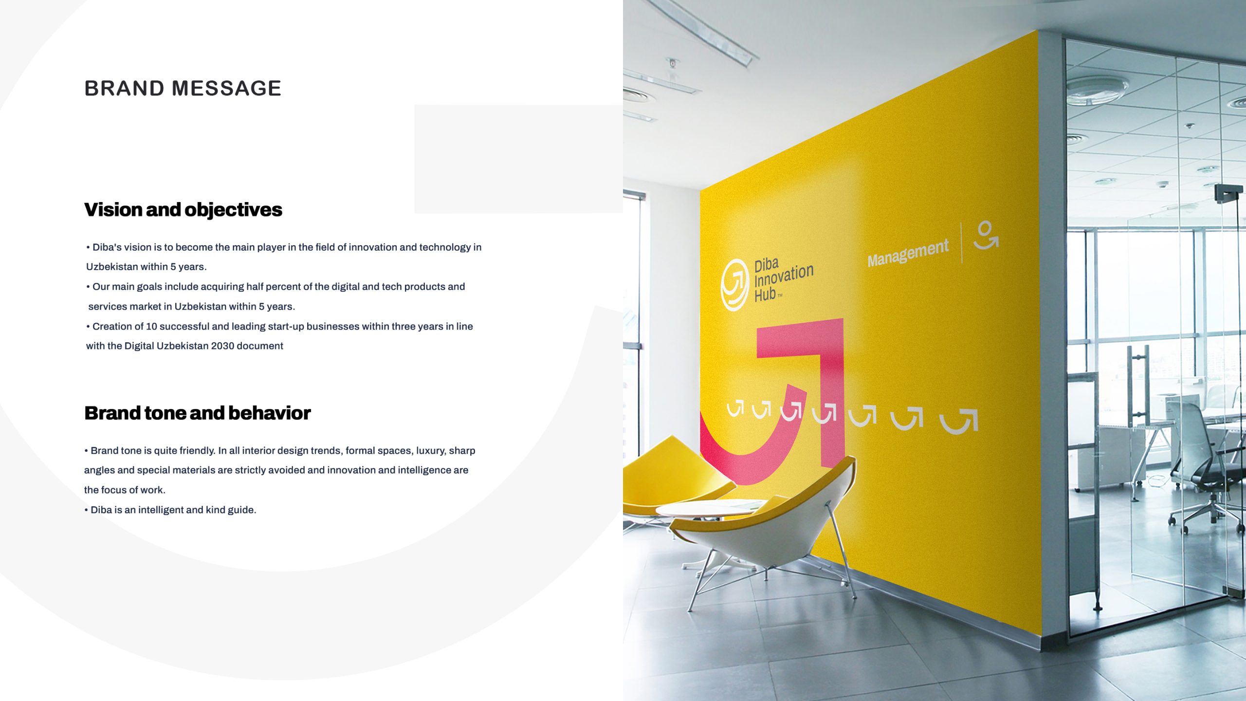
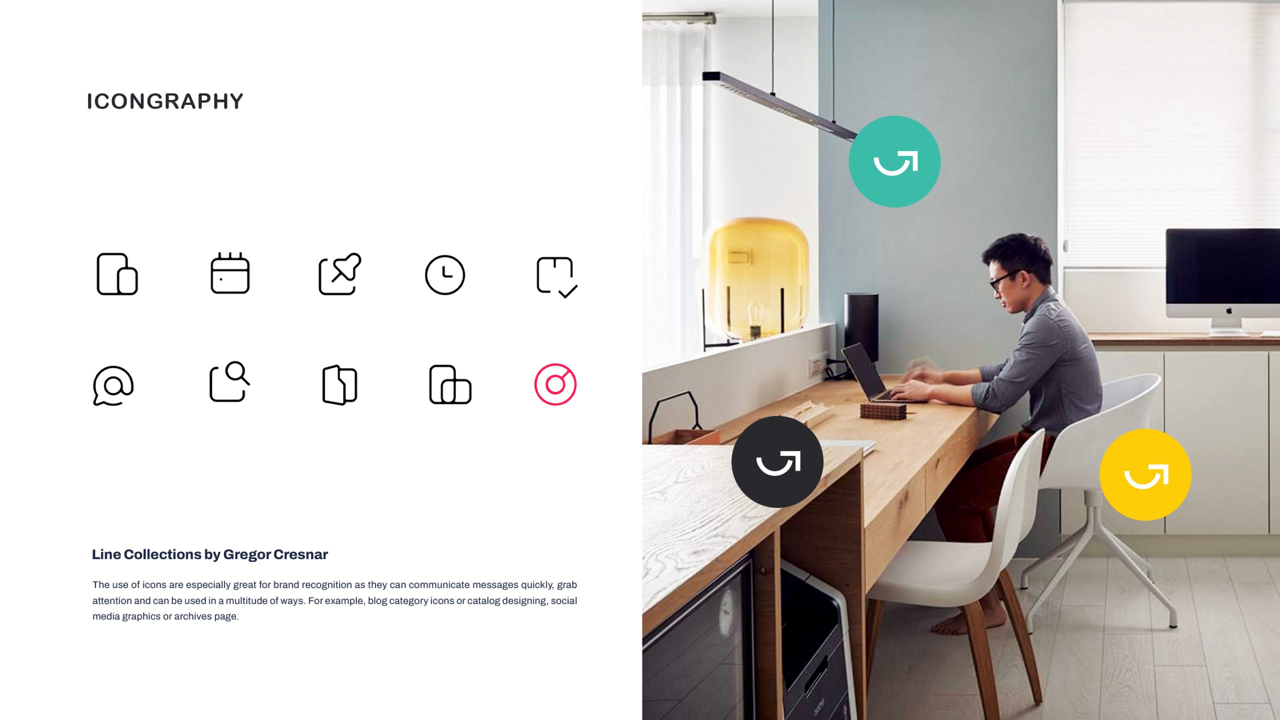
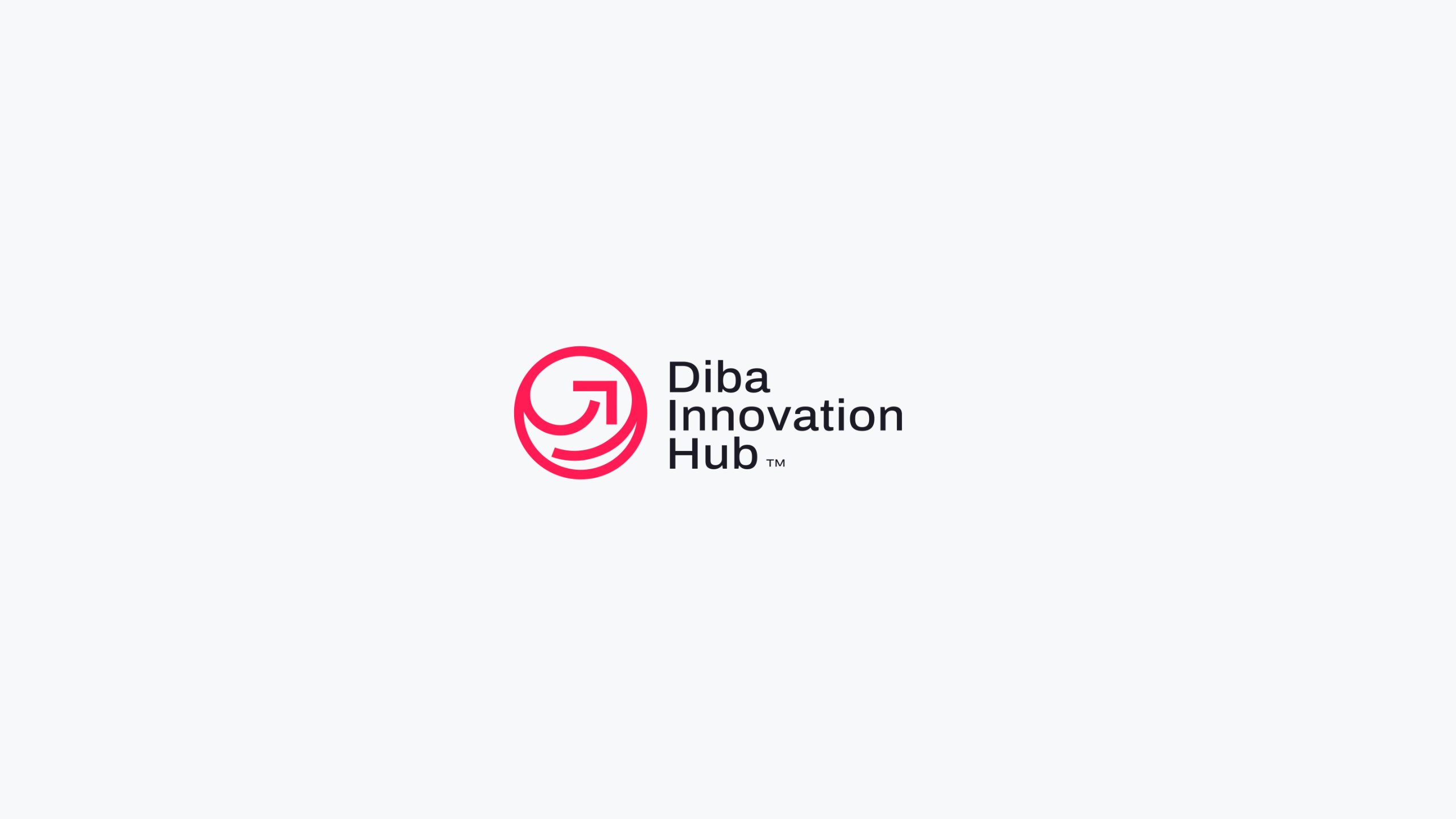
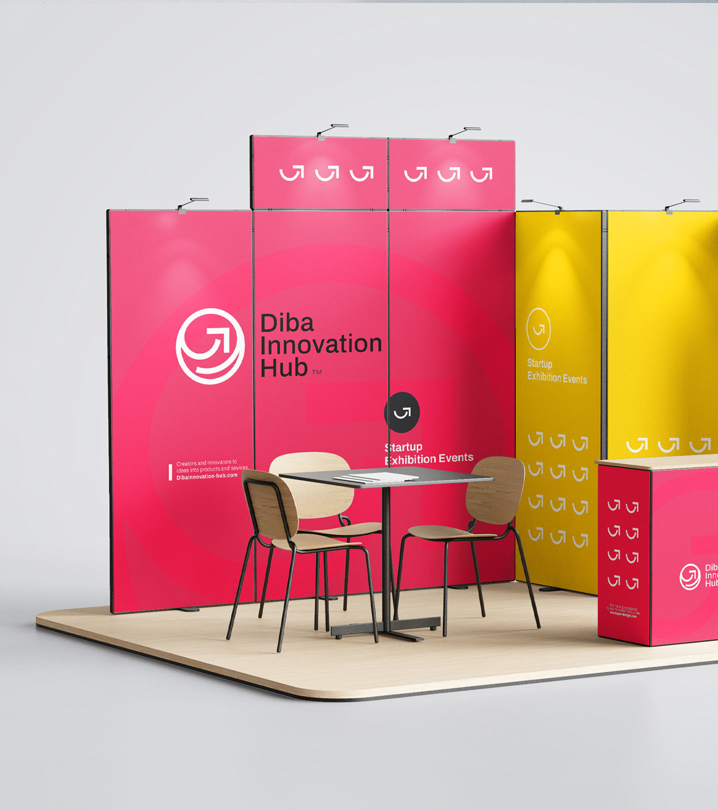
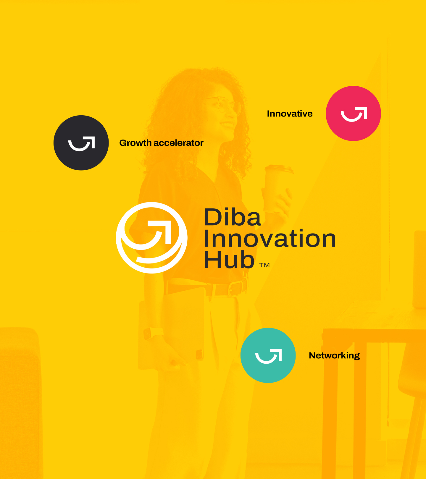
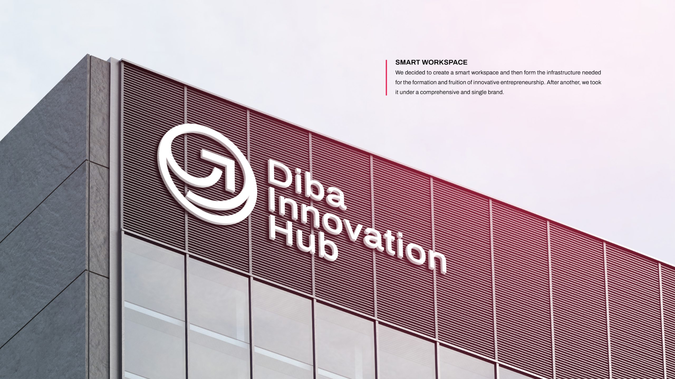
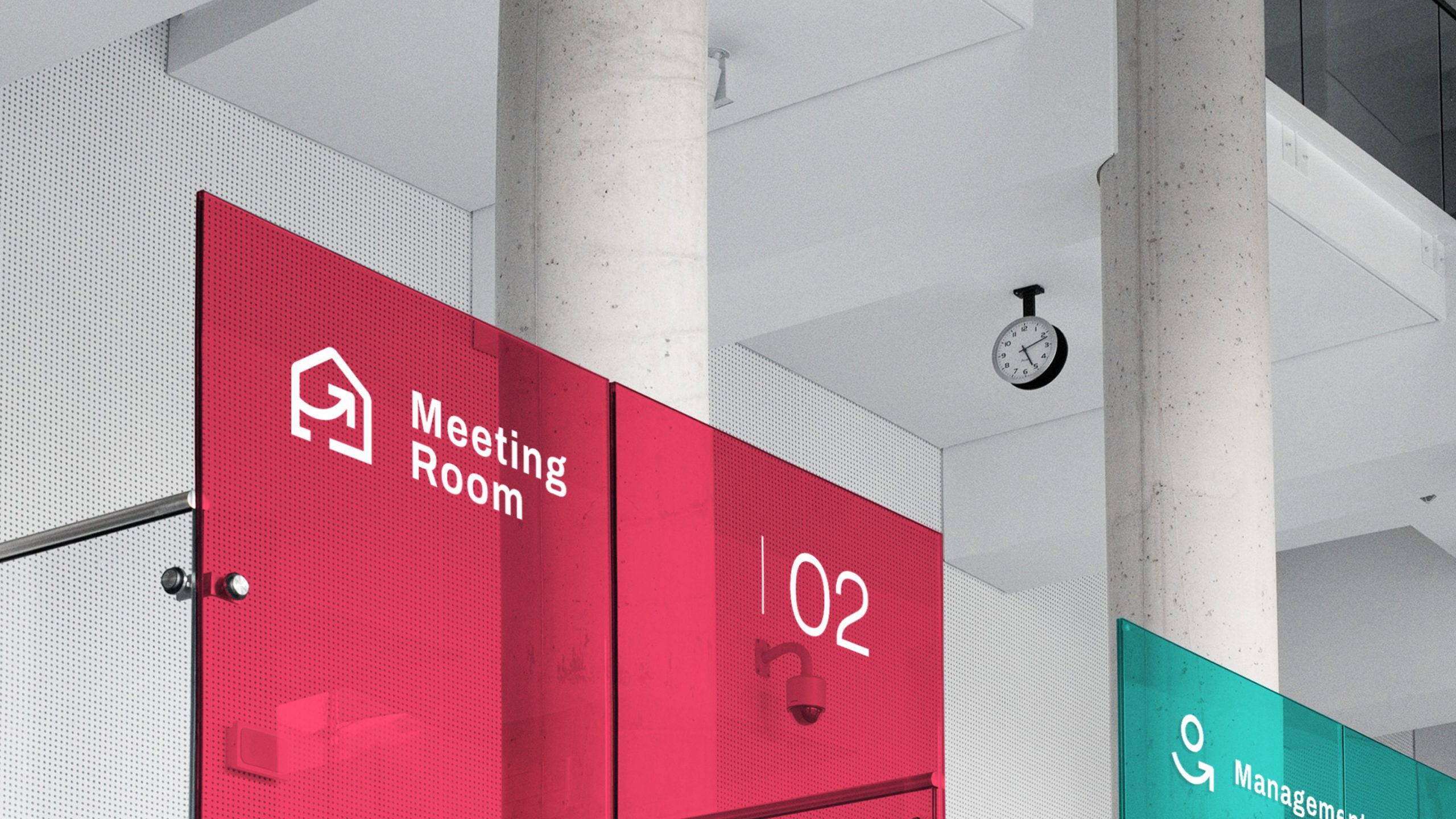
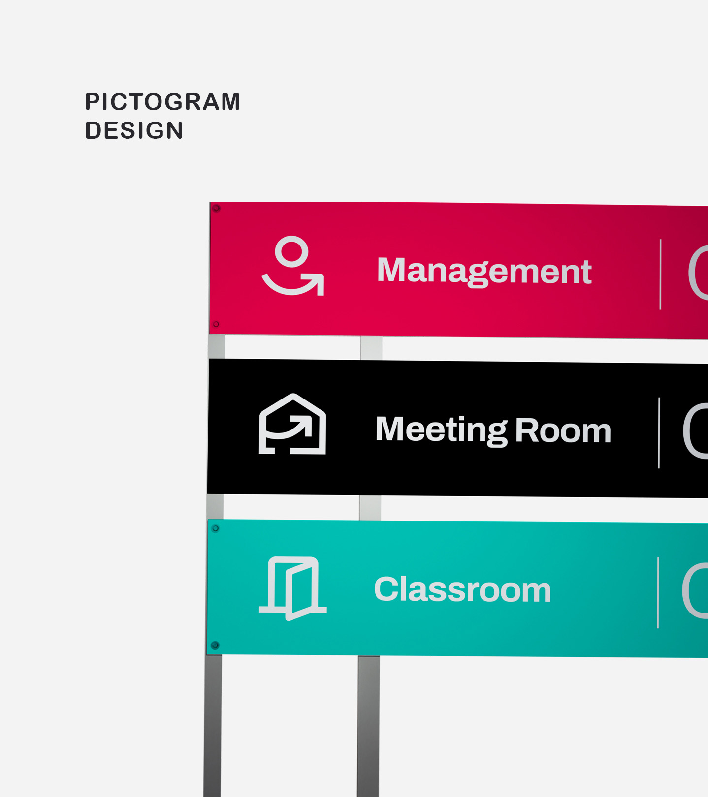
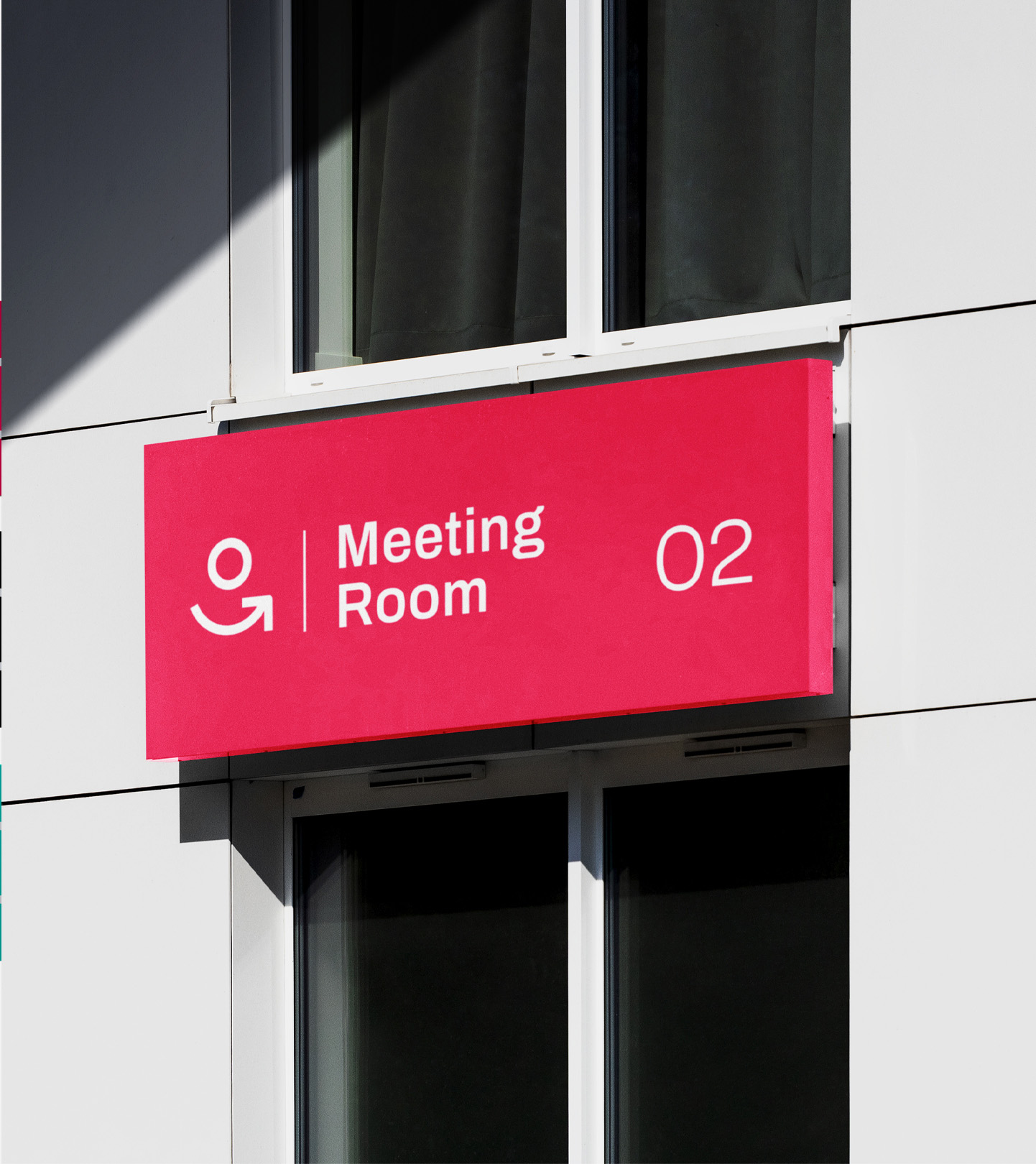
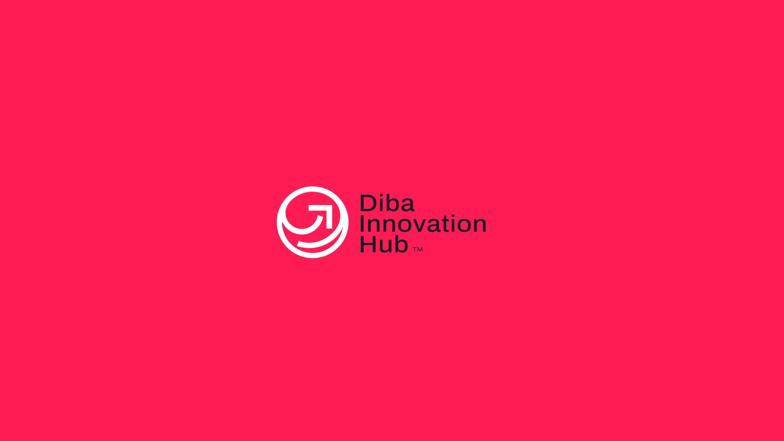
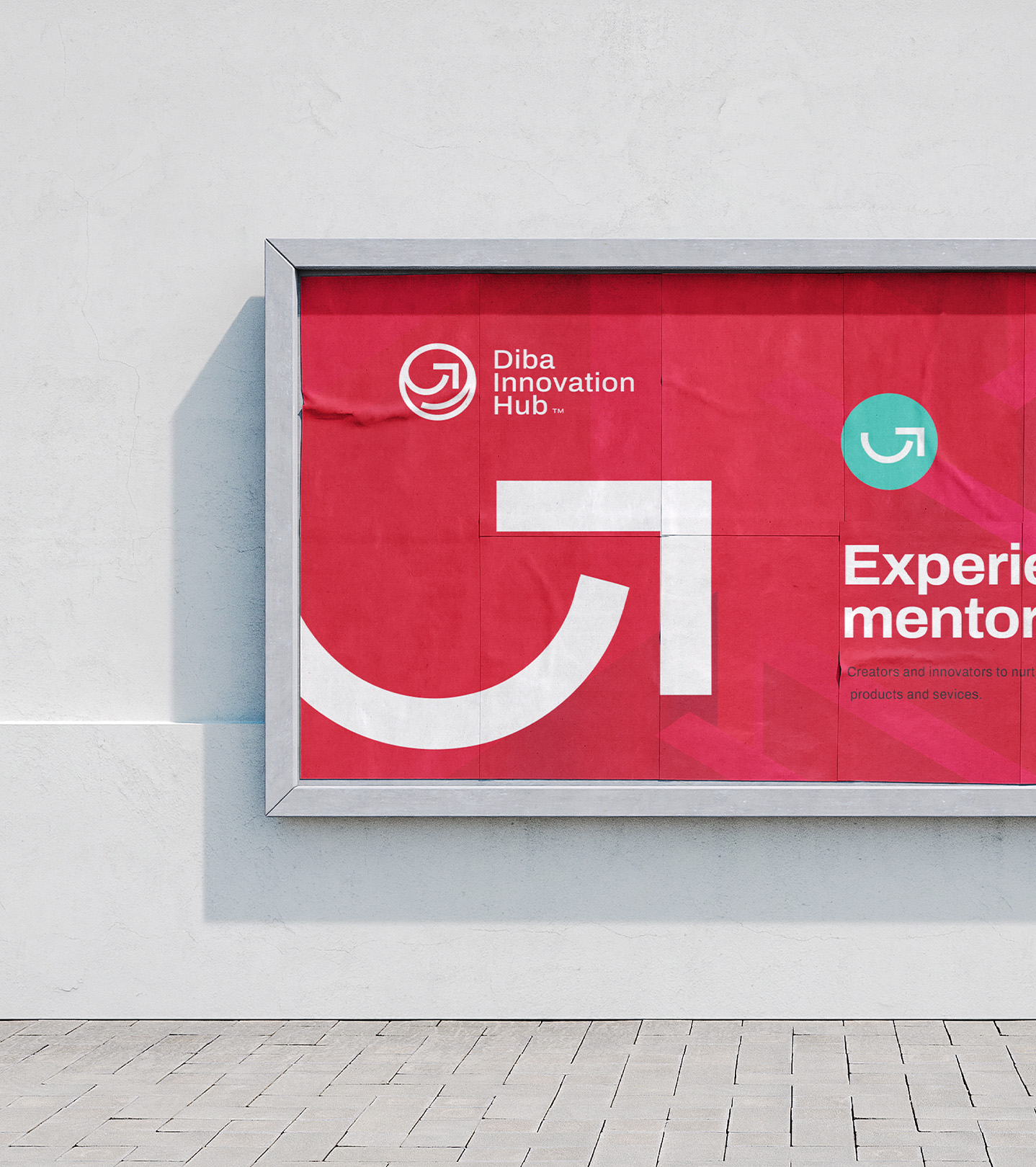
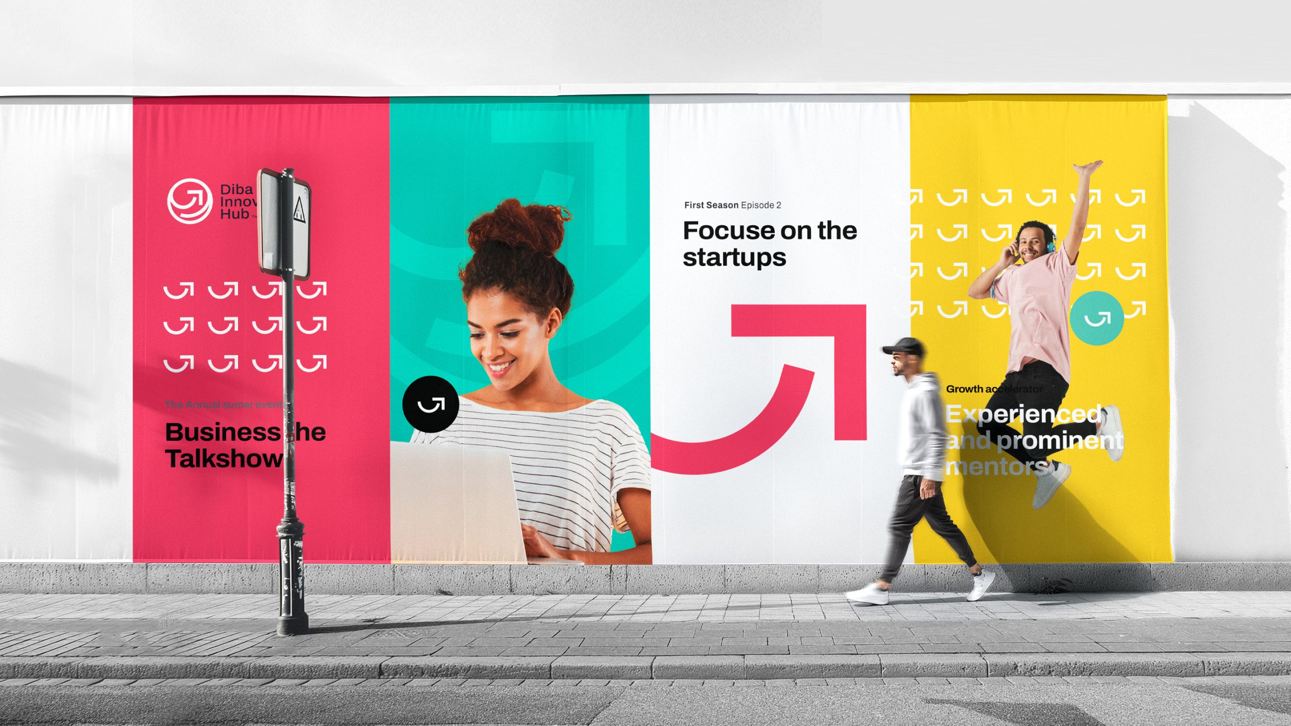
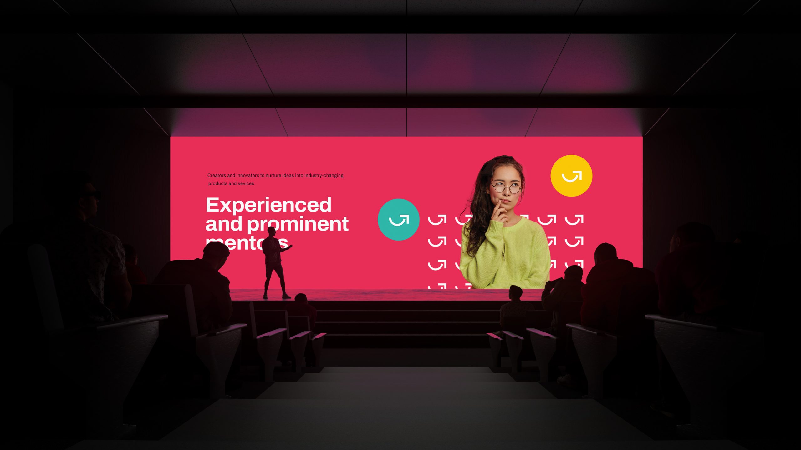
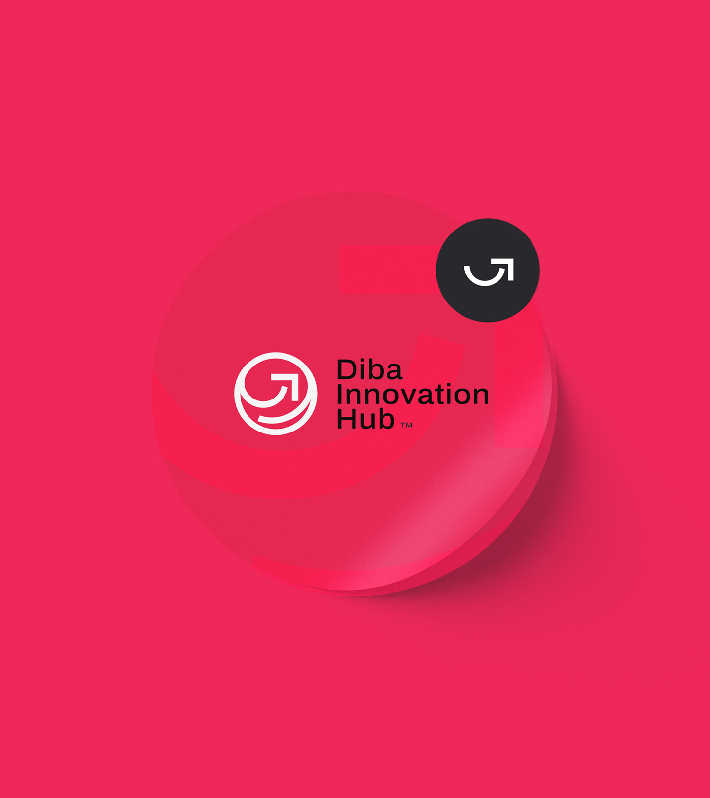
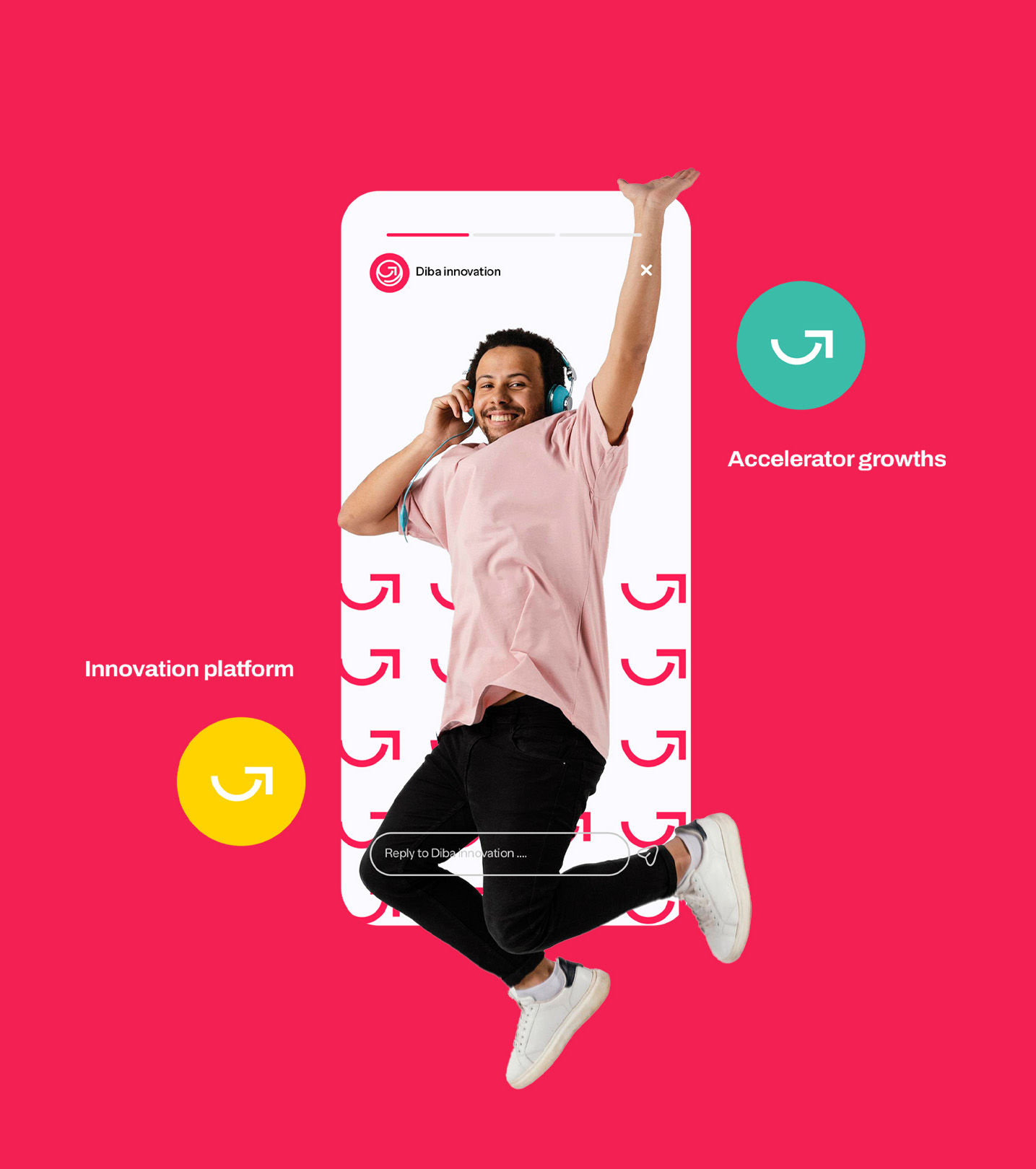
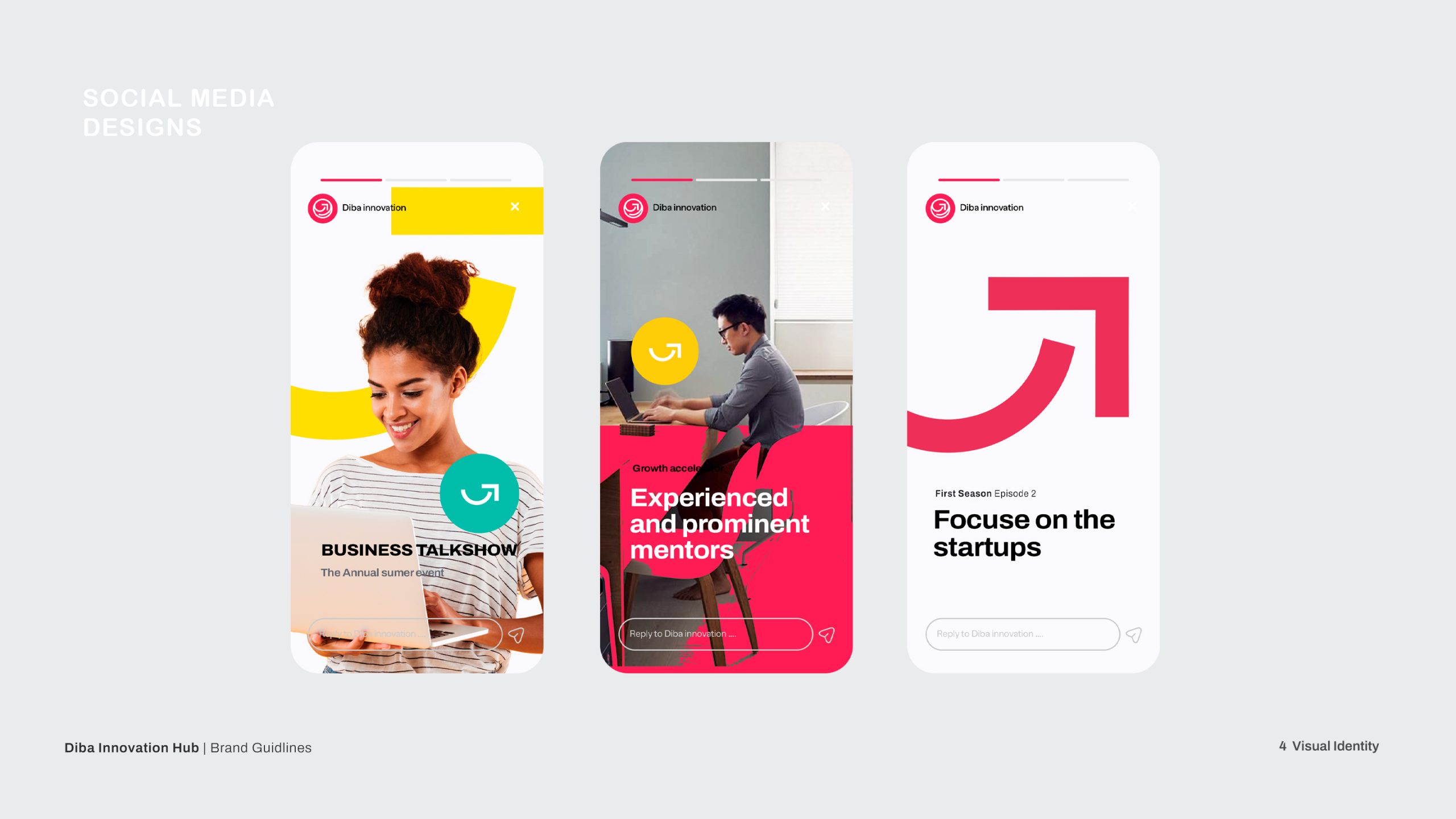
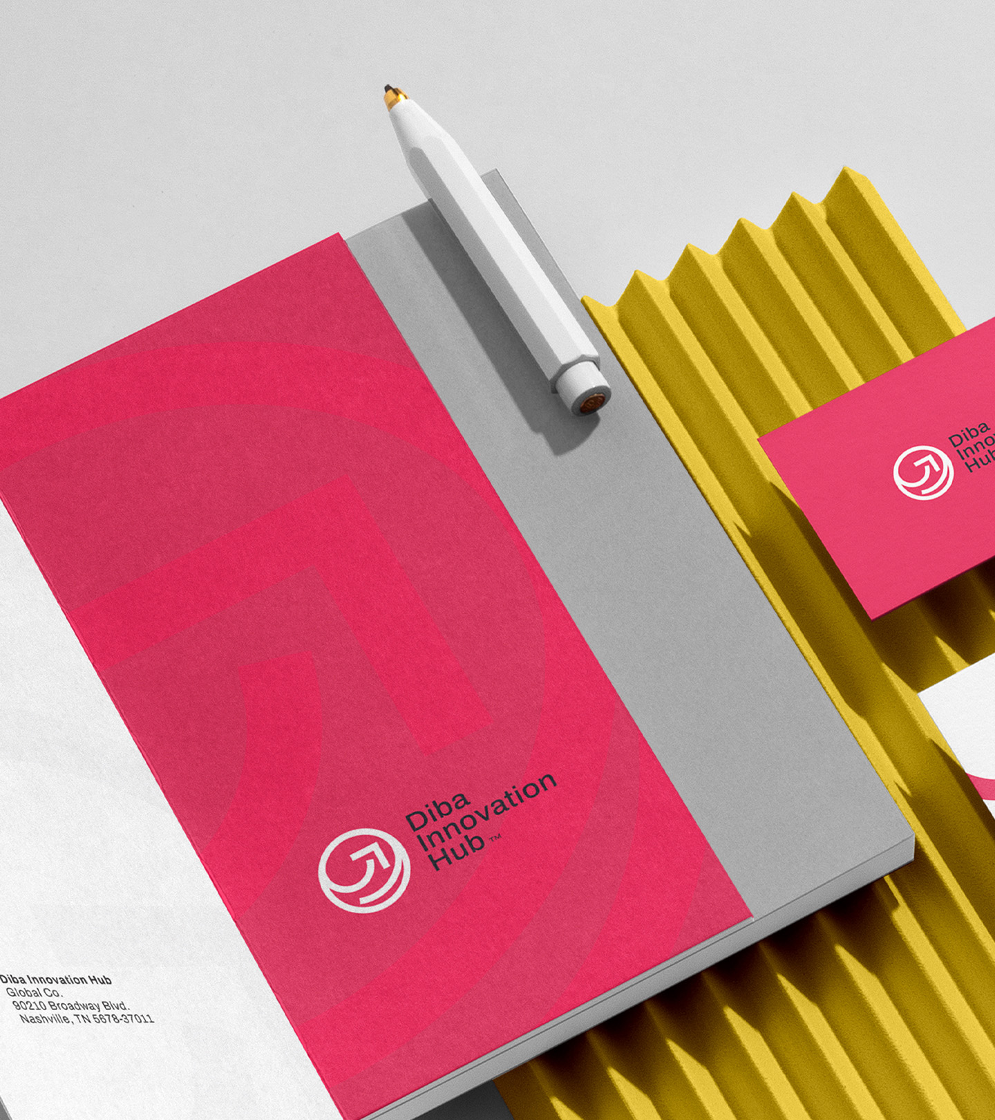
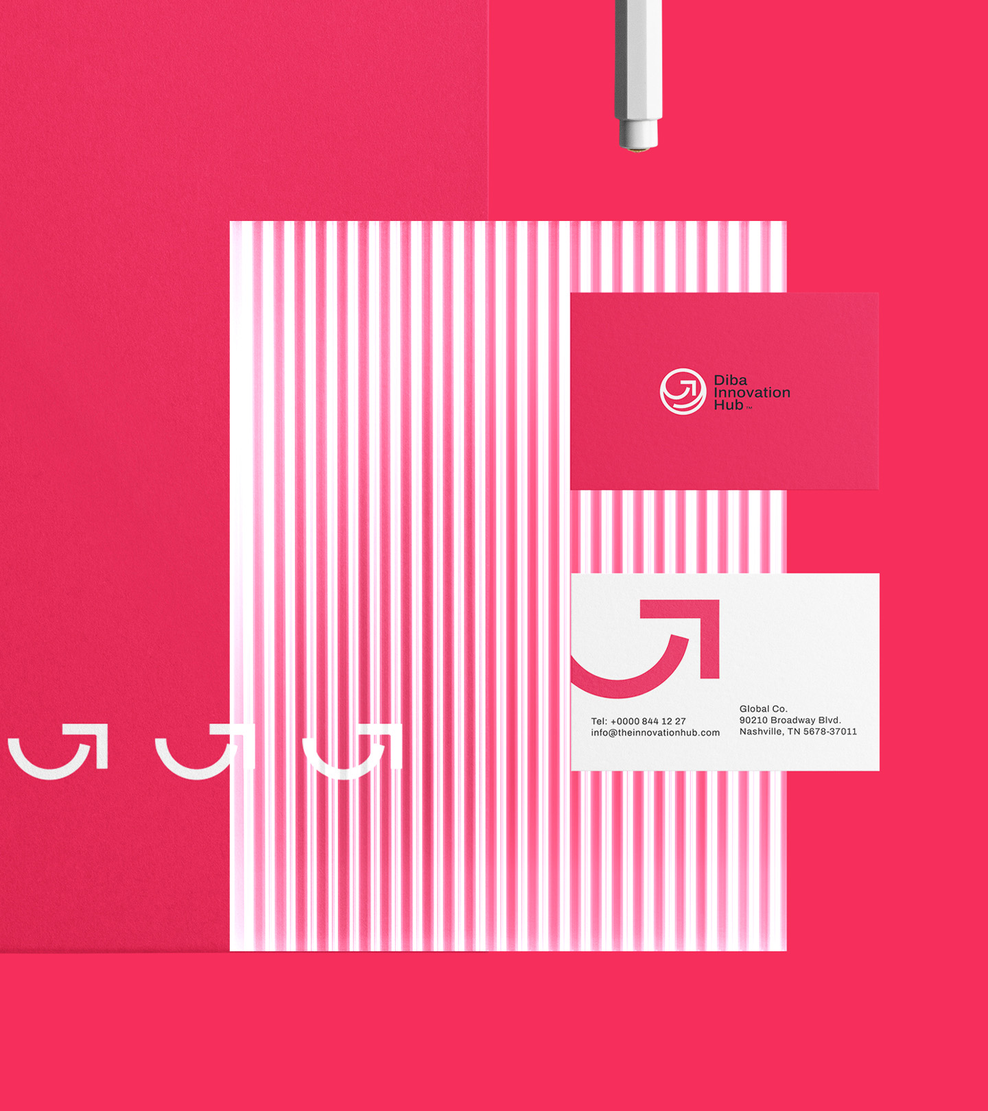
Diba Innovation Hub aims to provide an environment where ideas flourish, collaborations thrive, and businesses scale. Through a bold visual identity, we sought to: Communicate the hub’s commitment to growth. Highlight the dynamic and creative environment of a coworking space.Build a brand presence that stands out in the competitive startup ecosystem.
The logo embodies growth and upward motion with a sleek, minimalist approach. The circular form represents community and inclusivity, key traits of any coworking environment. The arrow-like curve signifies progress and acceleration, visually reflecting Diba Innovation Hub’s role in fast-tracking startups.
We opted for a bold and vibrant color scheme to evoke energy, creativity, and growth: Red: Represents energy, action, and momentum. Yellow: Symbolizes optimism, creativity, and positive thinking. Green: Reflects innovation, technology, and a fresh perspective.
Typography and Patterns
We used clean, modern typography for readability and sophistication. The custom graphic patterns derived from logo elements were integrated into various brand assets to create a cohesive visual experience. These patterns are versatile, adding energy and visual consistency to every touchpoint.
To ensure a seamless rollout, the visual identity was applied across multiple mediums, including:
Stationery design: Business cards, letterheads, and branded folders.
Environmental design: Office space visuals and coworking signage.
Promotional materials: Posters, digital graphics, and branded merchandise (e.g., coffee cups).